Fosters Architects
The challenge
Recently Fosters Architects developed a revolutionary system of modular construction that reduced cost and construction times. To celebrate this and use as a unique point of difference they decided it was time for a rebrand.
Approach
Right from the start it was important for the concept behind the branding to communicate this idea of modular construction. But before any design work could begin it was important to build a strong foundation based on a clear and focused brand strategy.
Brand strategy revealed the importance of communicating a clear and cohesive message to their clients, one that would set them apart from their competition making them the obvious choice.
My main objective for the rebranding of Fosters was to mature the brand and create scalable and consistent brand visuals that conveyed what they stood for and why their ideal clients should care.

Visual identity
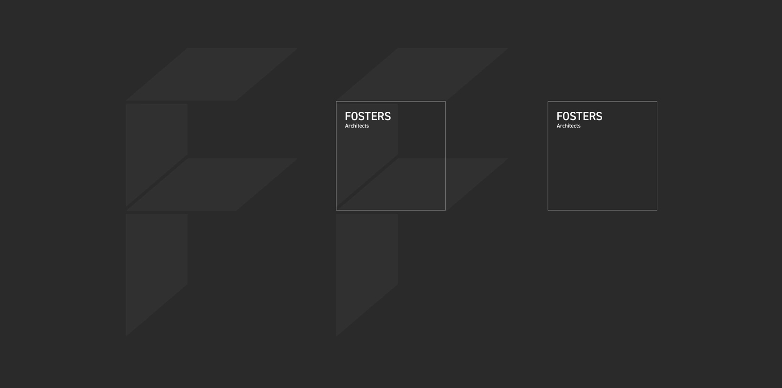
In creating a brand worthy of Fosters standing the solution I arrived at captured a sense of working in a 3 dimensional space with modular design elements that were both flexible and dynamic.
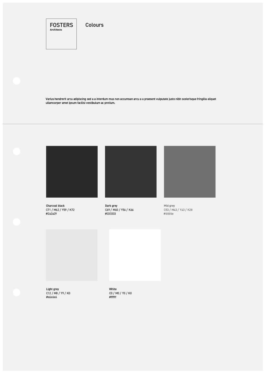
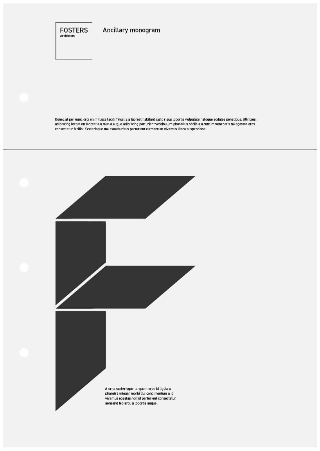
To arrive at the mark I took inspiration from a floor plan and the simplest form of building blocks to form the ‘F‘ as a supporting design motif. Pairing this with type and a monochrome colour palette provided Fosters with a unique platform to showcase their work.


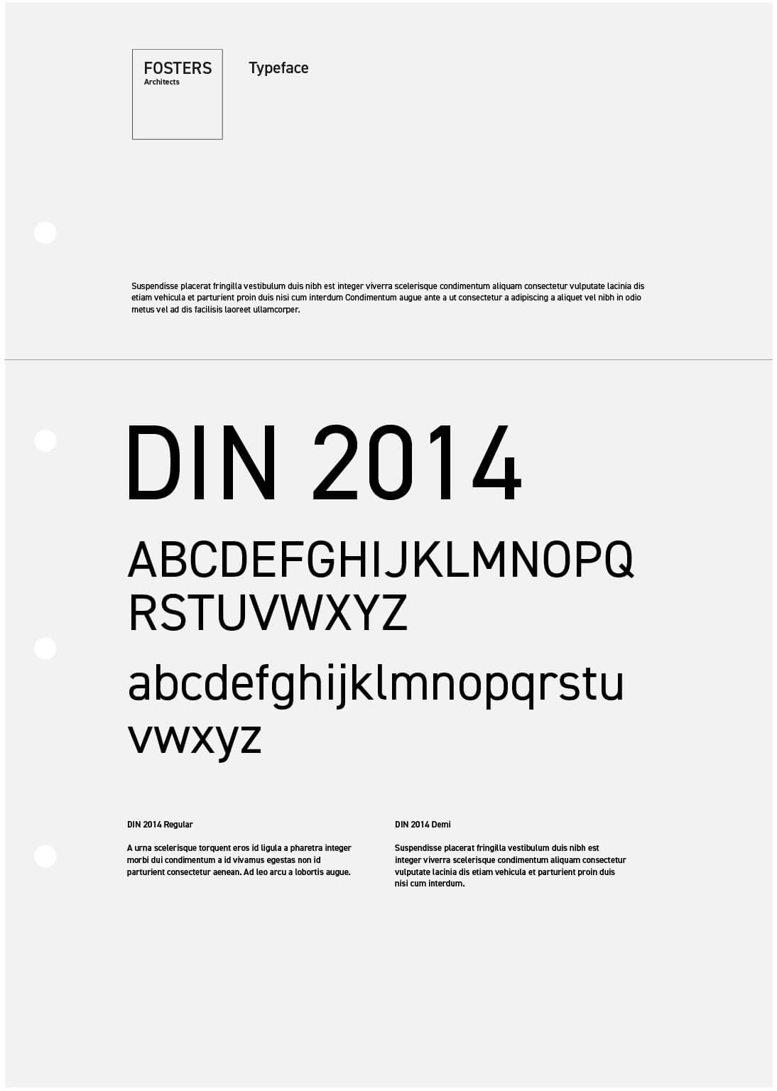
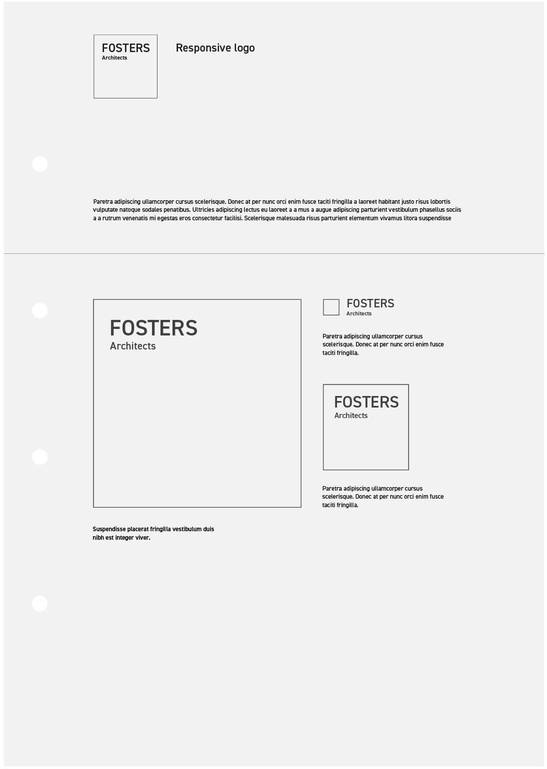
Brand guidelines
The identity guidelines ensured continuity in the use of the monogram motif and how to pair this with the logo, typography and colour palette.

Marketing materials
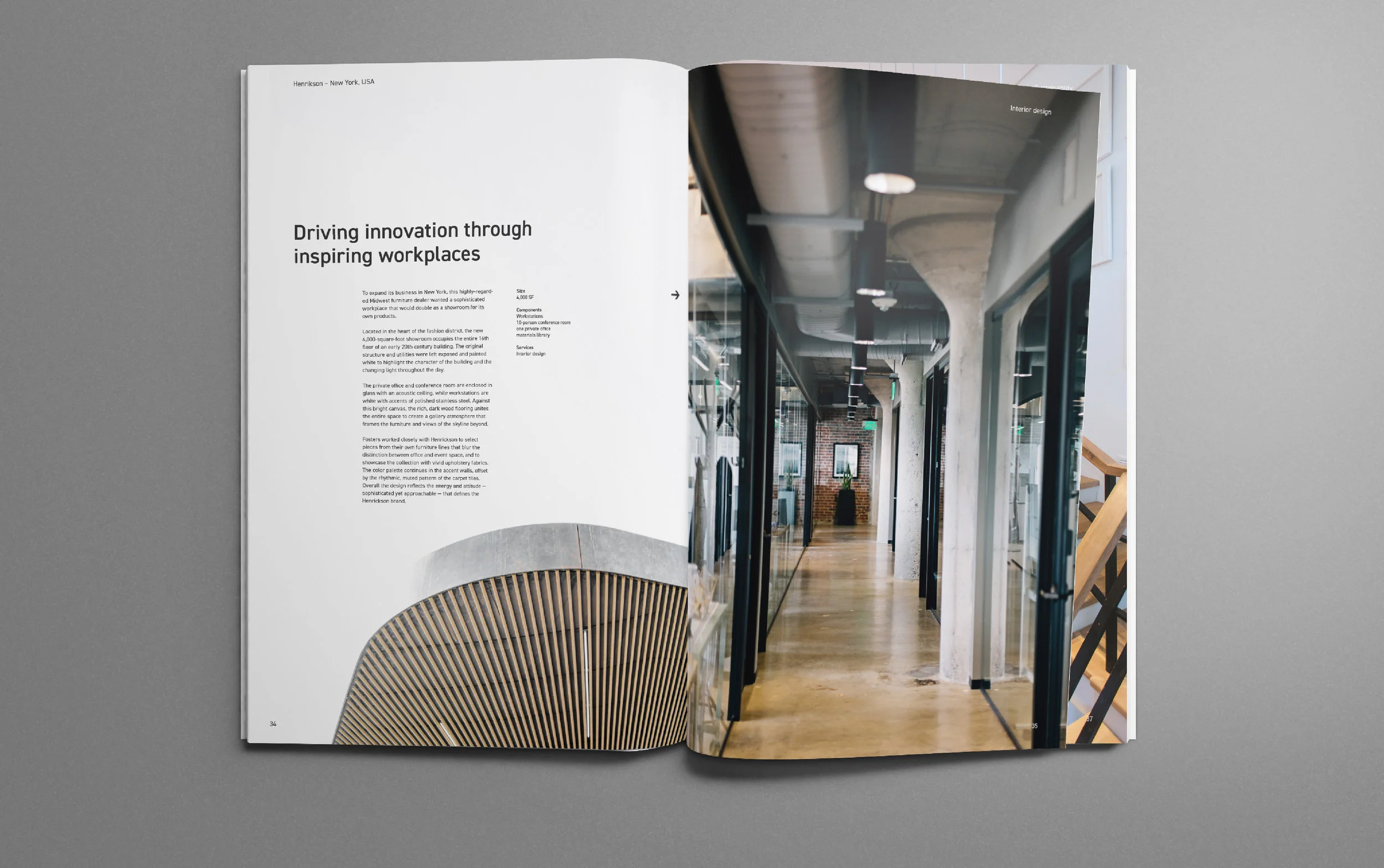
As well as creating a hard backed book showcasing their best work, brochures for the joinery, fabrication and carpentry divisions were designed, each using a sub-brand variation of the core logo.


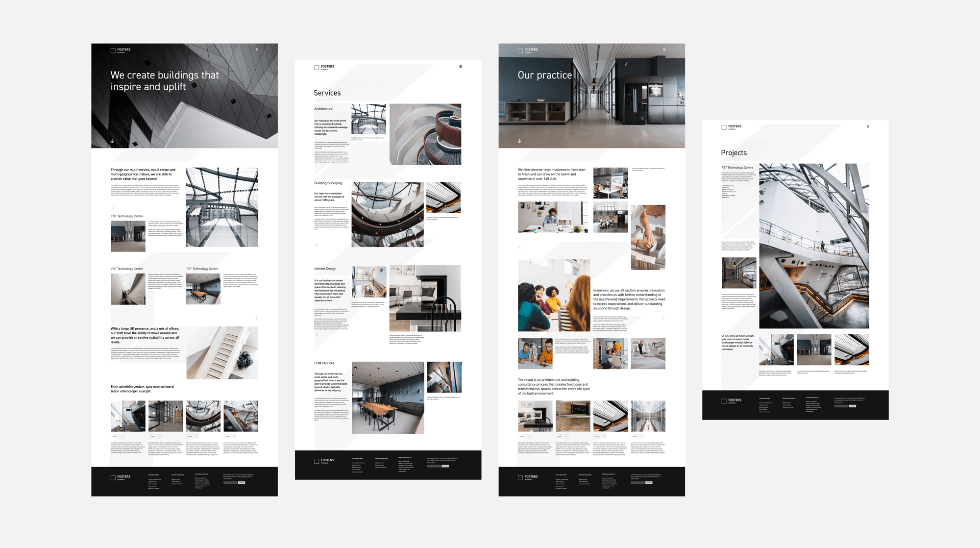
Website design
Weighed down by dense copy and repetitious content the Fosters website needed both rethinking and rewriting. I audited the content removing loads of extraneous copy and photography producing a wholly revised structure to design the site around. Initial designs continued the black and white theme of the new branding which added a contemporary minimalist feel. Making full use of the architecturally inspired grid system I placed photography front and centre. The abstracted monogram becomes a core component of the design, helping shape each page bringing the marque to life.