
SPACIAL
The challenge
The brief was to create a brand identity for SPACIAL, an exciting new exhibition for artists who used modern architecture as inspiration and was to be hosted by the Birmingham Museum of Modern Art. An entire branding system was needed to promote the show that was both visually immersive and engaging to the target audience. Because this is an entirely self-initiated project the first thing I did was to create a series of three poster designs that become the backdrop to the visual identity and represented work being shown.
It was critical that the design of the posters and branding system was eye catching and visually expressed the experimental nature of the exhibition. Because each poster was very different I created a typographic system that became the unifying visual component of the brand. This meant that it didn’t matter which poster design was used, it always became a backdrop to the typography.
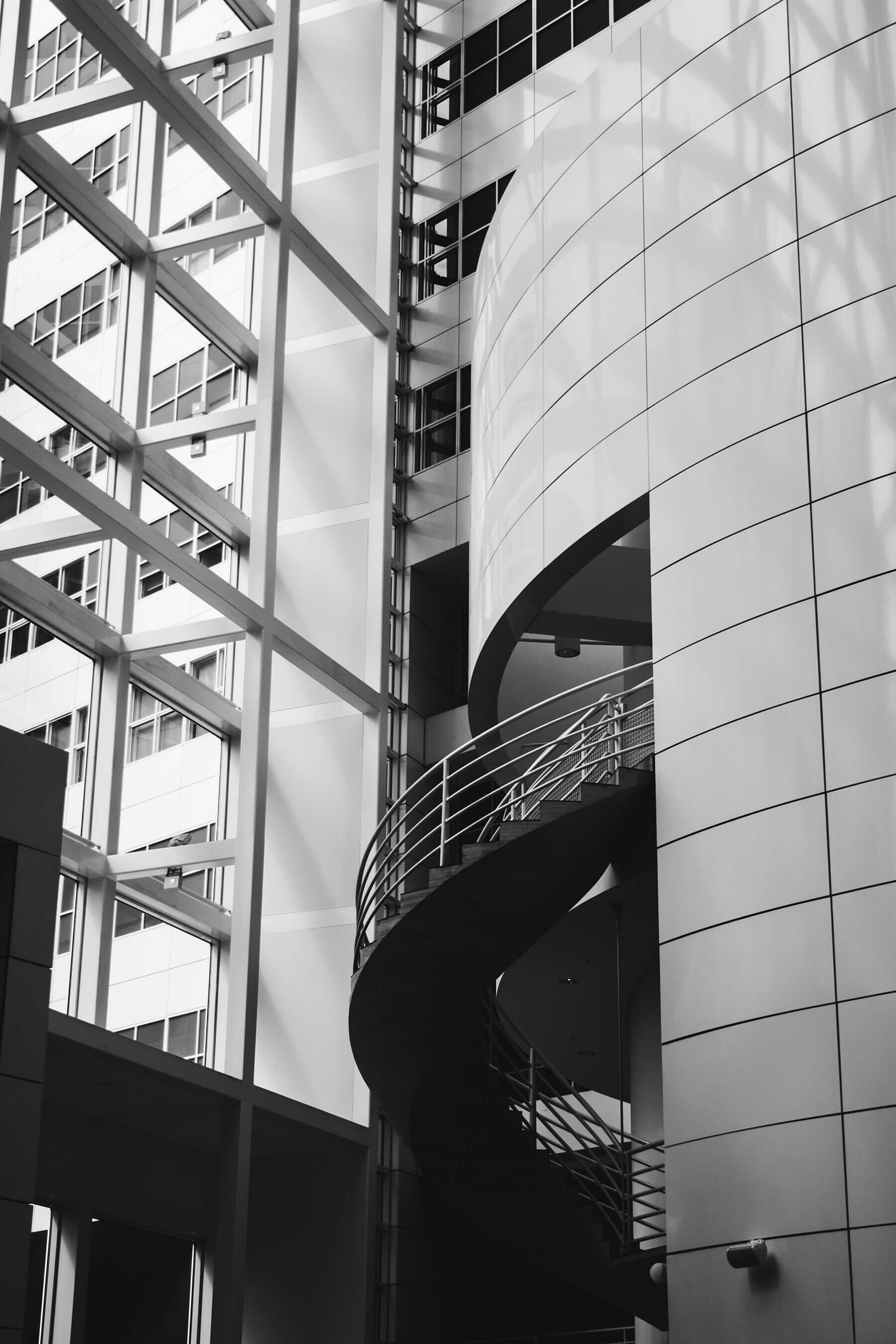
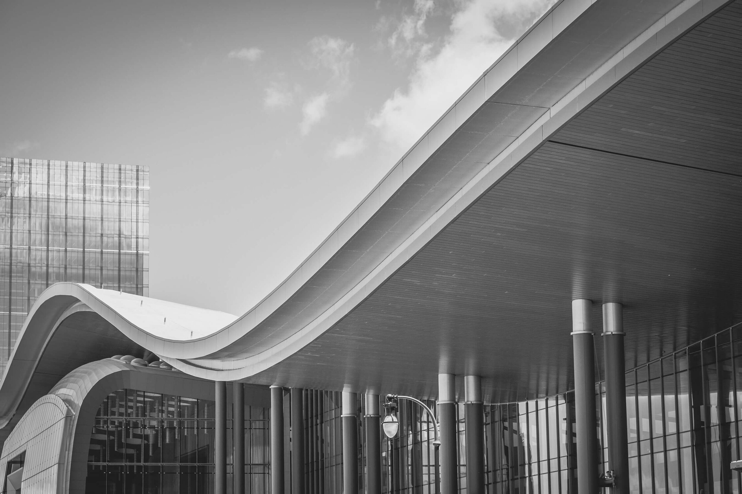
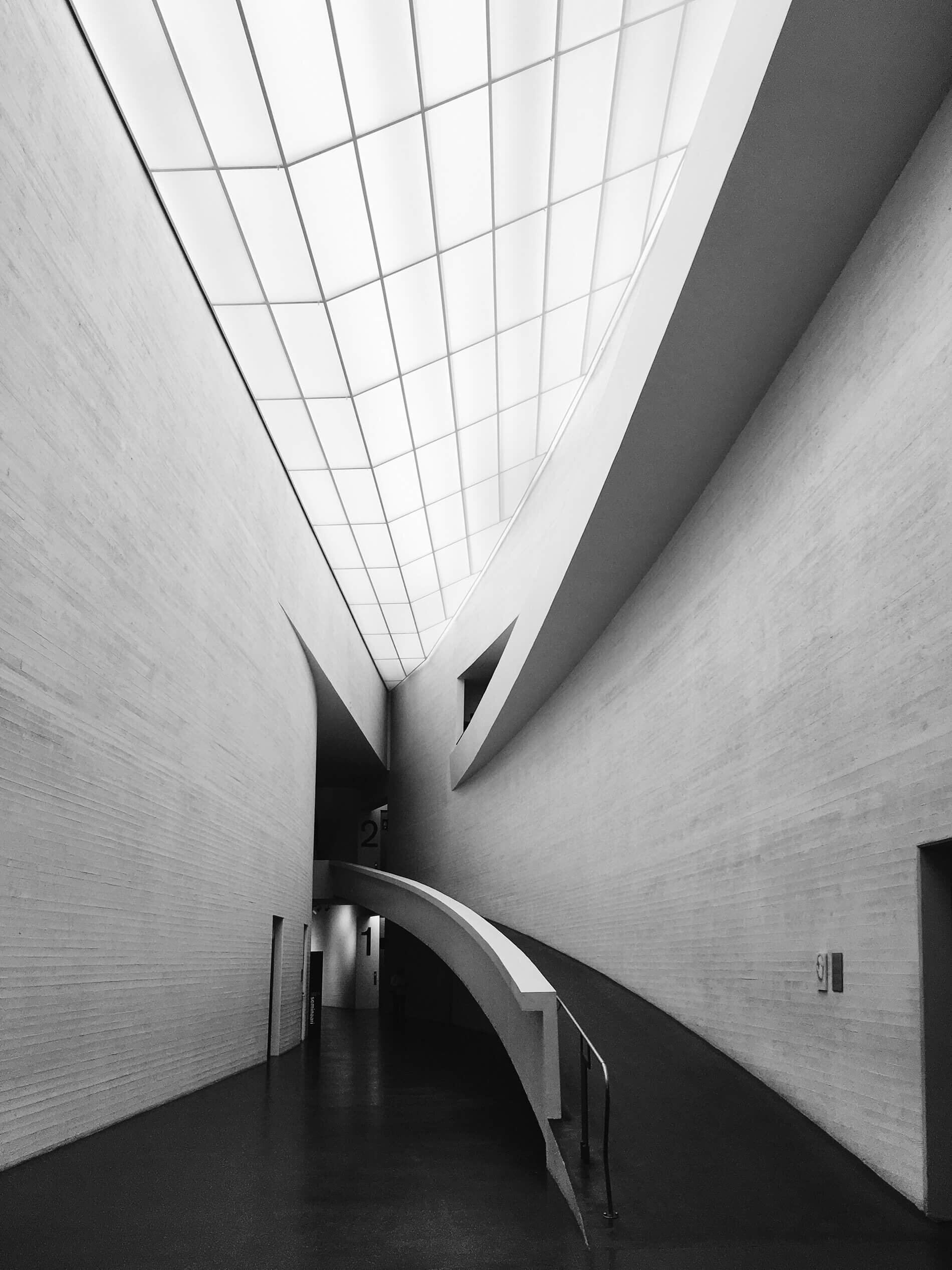
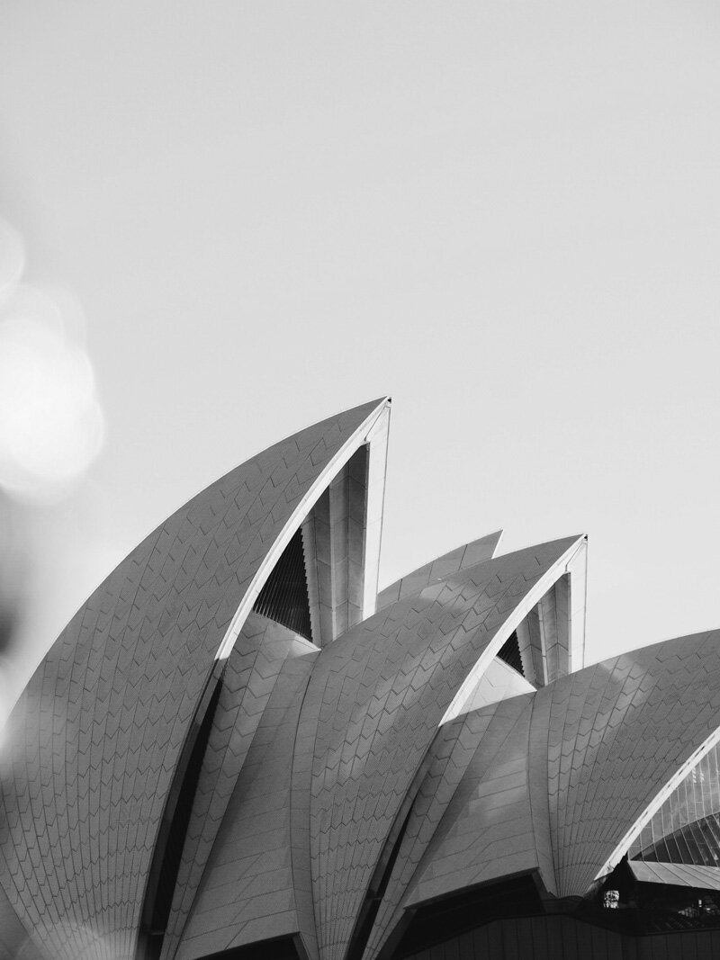
I took the inspiration for the exhibition artwork from the dynamic lines, curves and grids from the series of architectural photographs shown below. This opened up a great deal of inspiration and creative potential.

Concept development and exploration
Each poster design was loosely sketched out before beginning work in Adobe Photoshop and Illustrator. The actual design work was very experimental and organic and often involved pushing the software to its limits to achieve a certain result. The whole process was a lot of fun because I never really knew what might happen next.
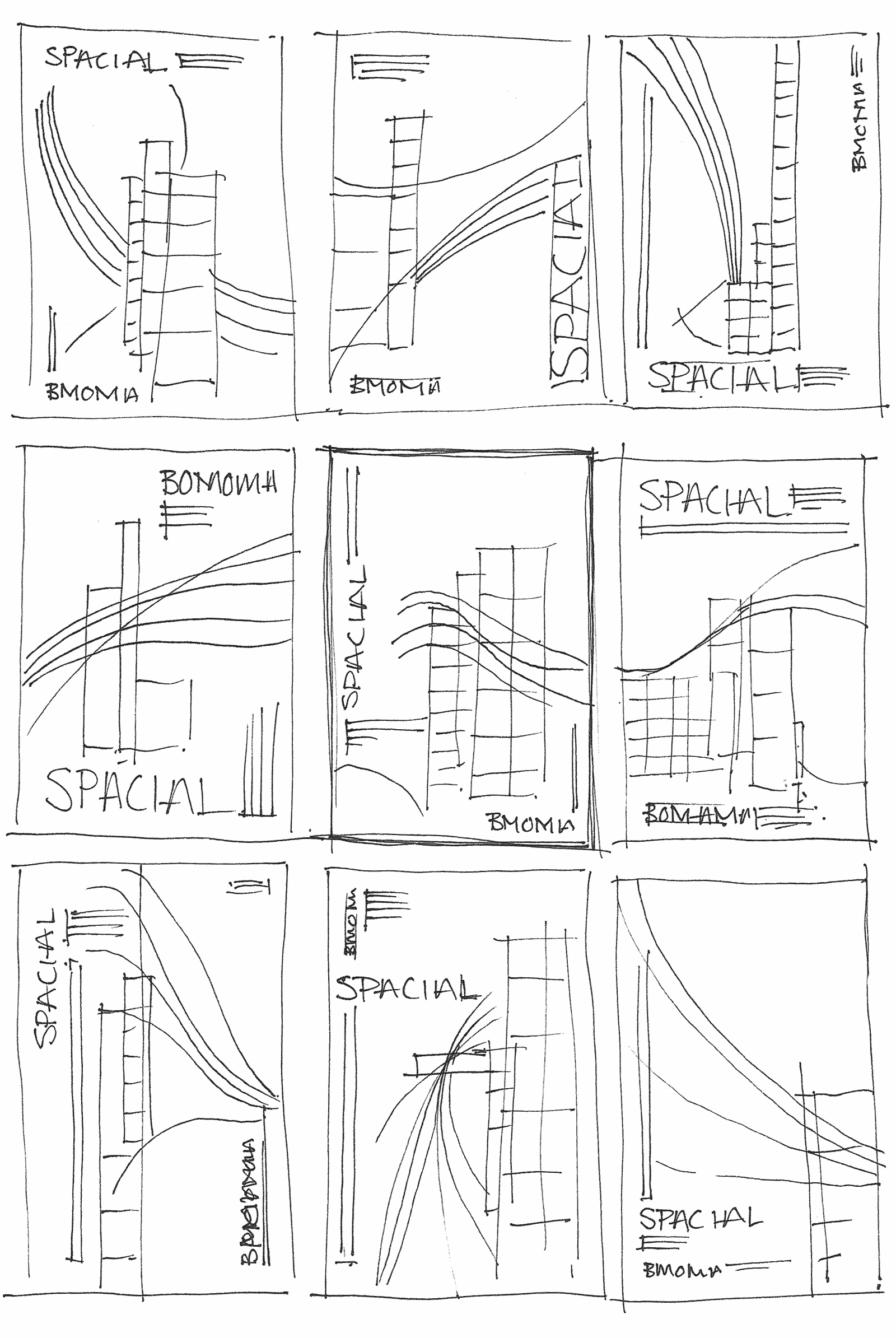
Initial poster sketches

Composite layering
Typographic system
With 3 completely different artworks being used across all touch points it was critical that the typography became the unifying component of the branding. With this in mind I developed a simple grid structure that allowed for flexibility in how the type was positioned. The only self imposed limitation of the project was to use the Birmingham Museum of Art and Design’s brand font, Futura.


Poster design
By placing the type around the edges it gave the artwork room to breath and take on a life of it’s own. This same approach in the use of type was applied to all marketing materials giving everything a very distinct and consistent look and feel.


Application and delivery
The flexibility built into the brand identity system allowed it to work across a wide variety of applications including tickets, a hardcover show catalogue that showcased each artists work, lanyards, exterior banners and even the gallery itself.
Admission tickets
Show catalogue
Lanyards
Museum banners
Gallery
Ticket ordering system
The brand identity for SPACIAL had to work both online and offline in a consistent and eye-catching way. With this in mind below are screens from the website that show the flexibility of the branding.
Home page
Landing page
Ticket ordering
Conclusion
In all my work I’m a firm believer in “simplify to clarify” and this project was no exception with the added challenge of working across both large and small scale applications. I especially love working on integrated branding projects like this because they give me an opportunity to create consistent and impactful visual identities that always deliver great results for the client.
Scope of work
Breakthrough Discovery
Brand attributes
Brand purpose
Brand personality
Ideal customer profiling
Branding and UI/UX
Visual identity
Wireframing and prototypes
Responsive website design
Marketing materials
Strategy
Website strategy
What’s next?
Just reach out! I'd love to hear about your brand or UI project challenges, even if you’re not sure what your next step is. No pitch, no strings attached.