
ZGI Architects
The challenge
ZGI are a start-up architect firm who were looking for a unique and dynamic brand identity to launch their company with. Right from the start they knew they needed to take a strategic approach to their branding because of the intense competition they were facing. The project included logo design, brochures, stationery, presentation templates and a website.
Approach
The very first step in any branding project is to get a clear understanding of the companies character and what it is that makes them different.
This is then followed by creating a detailed ideal client persona to understand exactly who we were going to be talking to. Through this we could shape the brand to appeal to them in a way that made ZGI appear to be the obvious choice.
All the actionable insights gained in this early stage were distilled into a ‘Brand Strategy Guide’ which became the strategic compass that defined ZGI’s future brand direction.
33 pages of thought and intention paved the way for a successful brand creation.

Bridging the gap
The brand strategy guide was used as the foundation stone to everything we did throughout the project and was referred to often ensuring everything we created was in alignment.
Then it was time to interpret the brand visually with a set of 3 stylescapes I created to define the look, style and feel of the new branding. This process allowed me to work collaboratively with ZGI’s principals, ensuring their vision remained true to their business objectives.

The three most important words in differentiating the ZGI brand: focus, focus and focus.
The final stylescape gave us a way of scaffolding the visual solution making logo design a more focused process that aligned closely with the brand strategy.
During the logo design stage I also looked at how it’s used across different mediums and touch points by creating a brand system. This was then presented to ZGI as a brand delivery document revealing the thought process and rationale behind everything I created and how it would work when applied. Most importantly of all it visually articulated who ZGI are, what they do and why it matters.
Because my branding process is entirely collaborative, ZGI were able to provide feedback at every stage. This allowed us to refine the focus of the brand until it was as close to perfect as possible.

My goal was for ZGI to use their new brand as a powerful strategic tool.
In most architectural firms brand strategy is separated from creativity by an incredibly wide gap. By applying my unique framework to the project I was able to successfully close this gap and build a charismatic brand that delivered the results they were looking for.


Brand guidelines
To preserve the long-term value of the new ZGI brand I created an online Digital Asset Management system. This not only gave ZGI’s vendors a single source of truth for the latest version the logo, colours and fonts, but also provided basic guidelines on how and where they should be used.
Brands are like people, so the way I like to approach brand guidelines is not to rigidly control the look and feel, but instead influence their character. This gives the brand the ability to quickly adapt to change and evolve over time as a process of continuous brand evolution.
Digital asset management
Execution, not strategy, is where the rubber meets the road.
Creating a brand from scratch represents a significant investment of time and budget, and for ZGI this was no exception. This required total commitment to the work being completed, with no room for a single step in the wrong direction.

Stationery items

Project proposal template

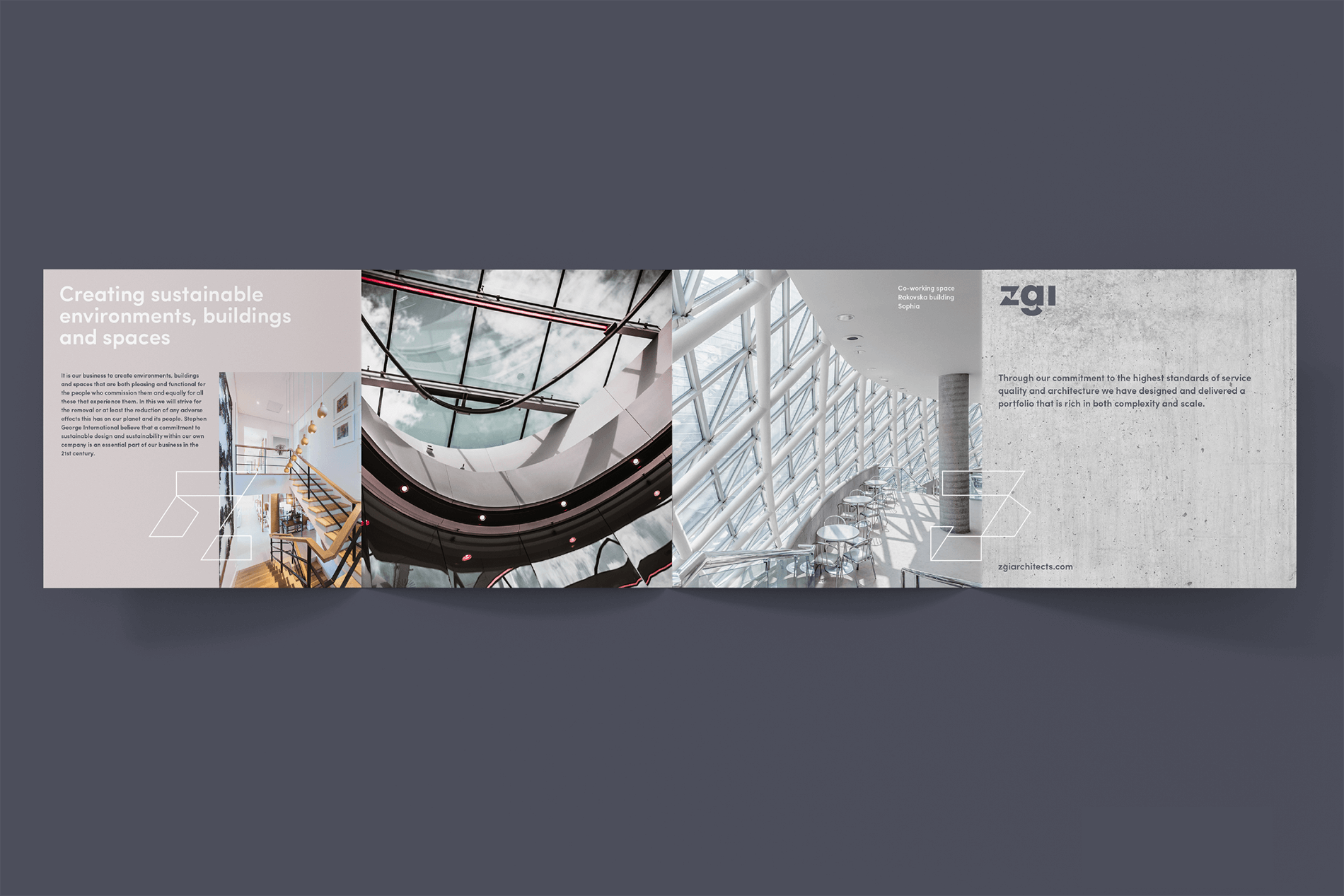
Portfolio front and back

Portfolio internal spread
No great brand is complete without an immersive website experience.
Too many architects websites are either minimalist to the extreme and say very little, or are just weighed down with poorly presented information. Clarity was central to providing an extra layer of differentiation.
Large scale project photos became the backdrop that drew the reader deeper into each page where the details came into sharp focus.
The end result was a brand that was consistent across every touchpoint and clearly communicated to their ideal clients that they can deliver on their promise.

ZGI website sitemap defining page hierarchy and structure
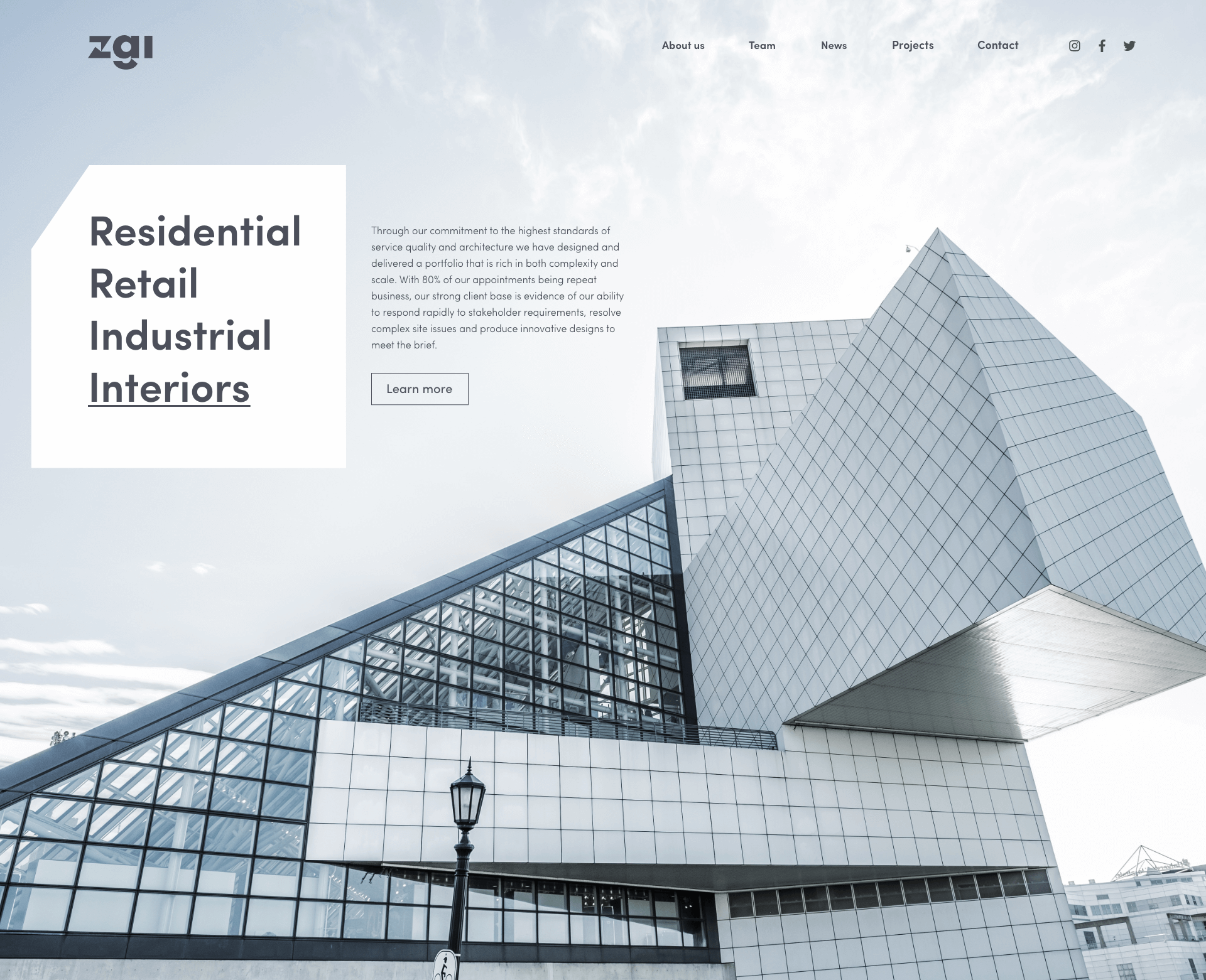
Final website design

