


Inspired and on brief projects delivered on time and to perfection
Everything I do is fuelled by a passion for what I do, the people I work alongside and the businesses I help. My skills are specific and fine-tuned and as a specialist I build brand identities and experiences to elevate and empower organisations, helping them thrive and grow.
Below you’ll find a few recent examples of branding and UI projects that have gone beyond the ordinary, helping each one realise their full potential through better, stronger branding.
Fletcher + Partners
A great design solution is impossible without fully understanding the problem. As with every project I work on I act as a “sponge” absorbing as much relevant information as possible about the client and the project before any work begins. This includes finding out what distinguishes them from their competitors, where they’re going in the future and what, from their perspective, the branding must help them achieve.
With Fletcher + Partners having a deep understanding of who they are, what they stand for and why their ideal clients should care was critical to the success of the project. Taking this approach ensures their branding says all the right things in all the right ways, setting them up as the obvious choice to their ideal clients.

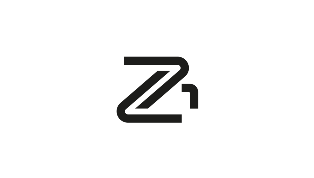
Fletcher + Partners logo became a decorative symbol that embodied the brand.
Their home page had to quickly communicate Fletcher + Partners value and lead you deeper into the website.

When designing the dashboard for Fletcher + Partners client app it had to be immediately obvious how it worked, as with logo design, simplicity is the key to a great user experience.
ALB watches
Every logo and website I design has to answer these 3 questions with a definite “yes”, is it appropriate? is it memorable? and is it simple? By taking this approach it ensures that the brand being created becomes a long-term, high value business asset. The ALB watches branding was no exception with its minimalist design and distinctive colours that reflected the company values and their own approach to watch design.

The ALB Watches logo with its strong geometric shapes has a distinctive and timeless appeal.
ALB’s e-commerce website gives their customers an easy way to connect with their brand and become lifelong customers.

Offline marketing materials help close the gap between the virtual and the real, further strengthening their brand and securing their market position.
Flexform Furniture
With Flexform Furniture it was important for the logo to fit their personality and become a container holding all the associations and feelings surrounding the company. This is much easier said than done when their branding had to work across many different touch points.
The only solution was to reduce everything down to its simplest forms making the logo easier to work with, long-lasting and distinctively different. Their colour palette supported and strengthened their brand personality in a way that was warm and inviting. This was complimented with a typeface that underlined the companies character and values.

The “F” in Flexform’s logo has a three dimensional feel that gives it a unique and distinctive character.
Flexform’s website design quickly communicates who they are and what they stand for and why you should care.

A strong brand is one that’s simple, memorable and consistently applied at every turn.
Jensen Motors
With a deep interest in sports cars I pulled out all the stops with a stand-out brand identity, website and brochure for Jensen Motors who specialise in sourcing ultra-high specification sports cars from around the world. It was important for them to convey a feeling of modern prestige, yet with a sense of nostalgia that connected to their classic car specialisation.
The logo design came about through studying the exhaust systems of classic cars and how their shapes resembled the letter “J”. The design I created became a distinctive mark that worked by itself or together with the name. The use of a deeper, richer British racing green helps communicate the spirit of the company and makes that important visual connection to racing.

The logo for Jensen Motors became an emblem that represented the spirit of their brand.
Brochures represent a great way of getting in front of potential new clients.

Everything about the website for Jensen’s was focused on communicating their value to their idea clients.
SkinSmith
Finding out where a brand stands (or more importantly doesn’t stand) is a crucial first step. Skinsmith were in the hugely competitive marketplace of mens grooming, so having a clear understanding of where they stood was critical to building a solid foundation for their brand.
Through their research they found what they believed to be a “sweet spot” in the market and wanted to convey a combination of ruggedness, outdoor adventure and premium quality. With this in mind I created a logo and brand identity that conveyed the exact brand personality they were looking for.

The challenge faced with the logo design was to make it simple yet memorable, combining the letter “S” with an anvil gave us the breakthrough needed.
The simplicity and strength of the logo made it easy to apply to their full range of mens grooming products.
Other logos and brand marks
Every logo and brand mark I create has a story to tell – full of meaning, clarity and purpose. Each time I push beyond the expected to deliver a solution that’s both timeless and memorable.
My process
I take a very focused problem-solving approach to creating brands and UI’s. While it’s essentially a creative process, I don’t follow any personal or artistic agenda or style. Instead, I work to address the challenges and parameters of the project in search for visual and marketing solutions.
Every project goes through this proven process that guarantees great results:
Step 1: Research
Every project begins with gaining full understanding the problem through asking a series of questions designed to dig as deep as possible. The goal is to understand things like differentiation, what the future looks like, and what, from your perspective, the project must help achieve.
Step 2: Strategy
Once I feel that we have defined the problem adequately enough and gained sufficient knowledge of the business, I begin to work out the strategy for designing an effective solution.
Step 3: Design
Design is a very collaborative process where we meet every few days to discuss progress and the design work produced.
Taking this approach can produce solutions that have the potential to endure, they’re relevant to the business and can be used flexibly and consistently, so they don’t need to be changed in the foreseeable future.
Step 4: Production
The final work is produced and delivered.
What’s next?
Just reach out! I'd love to hear about your brand or UI project challenges, even if you’re not sure what your next step is. No pitch, no strings attached.